|
Good news, everyone!
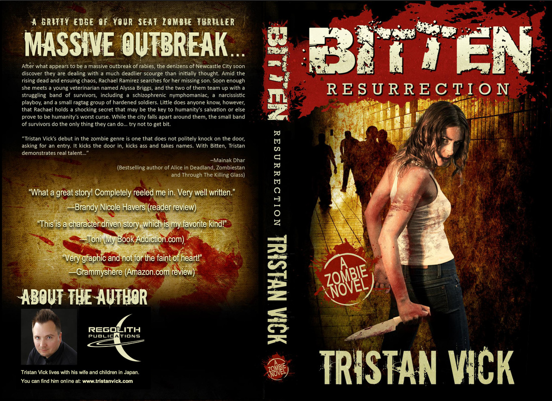
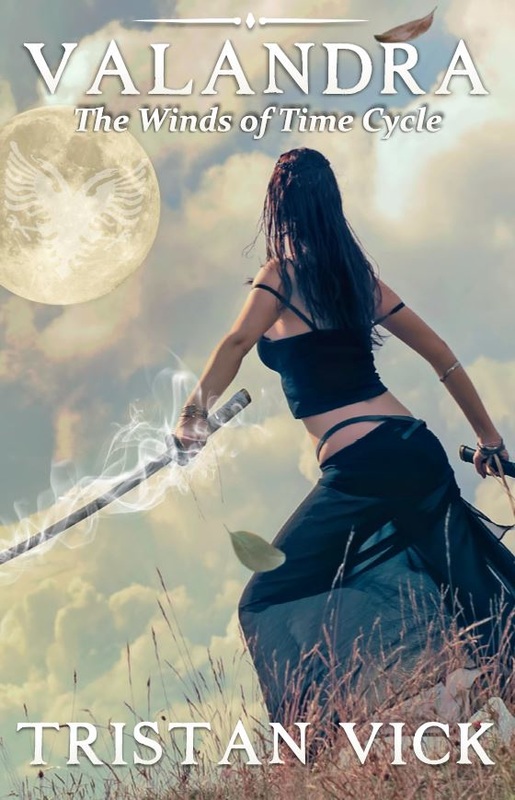
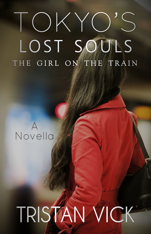
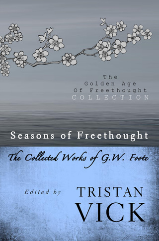
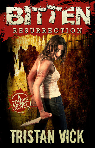
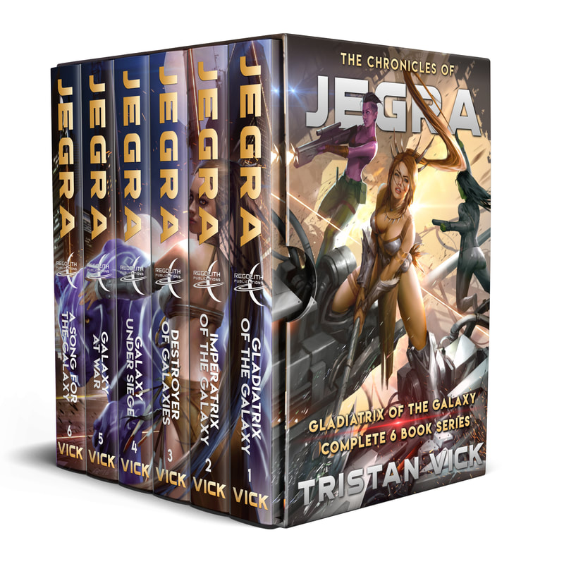
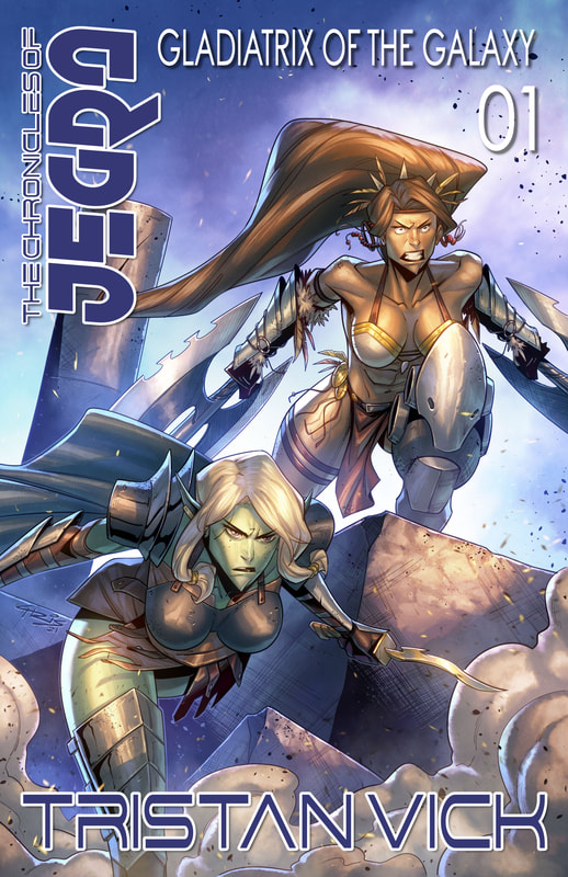
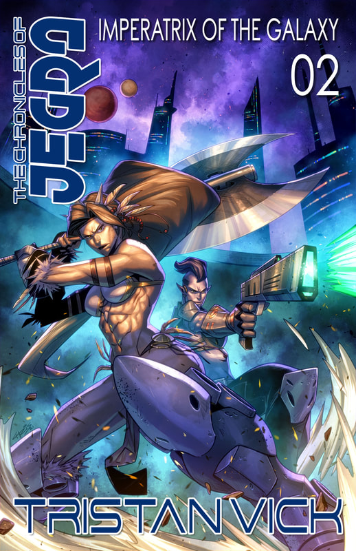
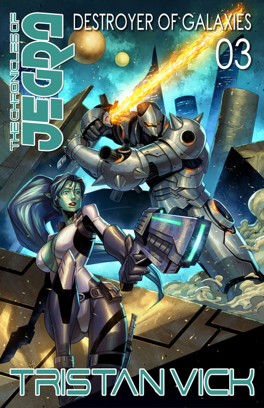
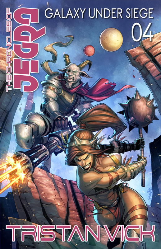
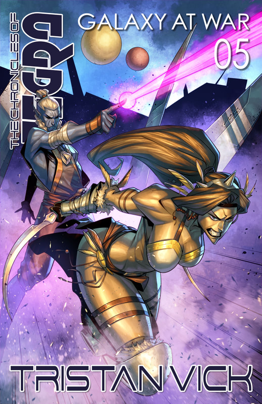
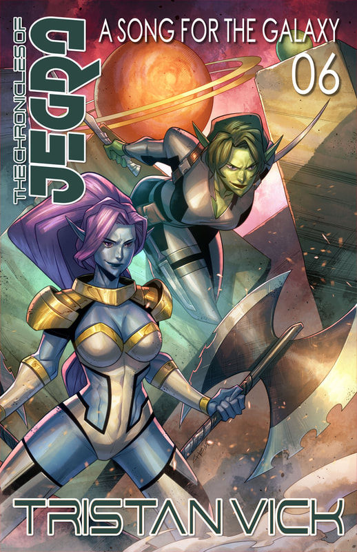
Due to the re-acquisitions of my copyrighted works and the republishing of past titles under my exciting new Regolith Publications imprint, I am once again an official mirco-publisher! All that means is I published 5 or more books this year. That said, being a micro-publisher doesn't do anything for me other than force me to fill out extra information on my taxes. Yippy! This year I redesigned many old covers to help the rebranding not only get notices but look sexy. I want my imprint Regolith Publications to make a statement. I want people to look at my books, and my body of work, and say that this guy is at the top of his game. As such, I went back to make everything as professional as I could make it. And I'm proud to say the final products look more professional than the publisher I was with! But that's understandable. Big publishers want to churn out books and make a profit, which means if there's a minor error that slips by and they don't catch it before going to print they let usually will let it slide. With Indy publishing, however, and the print on demand (POD) model of self-publishing, if I find a mistake, or want to tweak something, I can have it done over night. I prefer it this way. After all, I was hugely embarrassed by the dissimilar subtitle fonts on my BITTEN covers when released under Permuted Press. And when I pointed it out that they were using two different fonts on an ongoing series title, I was told they'd fix it when it went to print. It never went to print so the mistakes remained. That's one of the reasons I took the rights back to my books. I just kept seeing errors left and right. Errors that I wouldn't tolerate as an Indy publisher and which no serious publisher should allow. After all, when I signed with Permuted Press they were making the transition from digital POD style of publishing to the classic brick and mortar style of publishing, which means they should have been on the look out for minor discrepancies in cover art to begin with. But I"m not complaining. It's all water under the bridge and I have the rights back now, so there's only onward and upward from here on out! That said, here are the covers I newly designed or else redesigned this year. The BITTEN cover (at the top of the page) is of course designed by the talented Glendon Haddix over at Streetlight Graphics. I, of course, took the liberty of changing the back cover's content some.
0 Comments
The politics of modern book publishing is a finicky thing. If you don't do it just so, you won't get ahead. After lots of deliberation, I realized that my books would thrive better under my own control than that of Permuted Press.
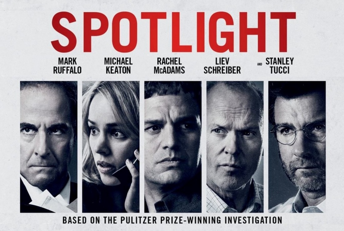
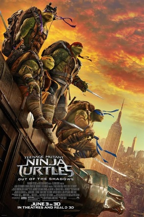
The breakup, however, was mutual. Since my properties sales have all but stagnated, Michael Wilson, the head of Permuted Press, graciously agreed to revert the full rights to my book series back to me. Although I feel a slight twinge of disappointment, as being published by a mainstream publisher was (and still is) a dream of mine, I should point out that the experience was well worth it. I learned a lot about the game of publishing. The number one take-away I got out of it all was that I learned not to sign a contract without an agent representing me (nor should you). Not under any circumstances. Even if the deal seems real sweet. As the saying goes, if it sounds too good to be true, it probably is. There is always some bi-line or sub-heading that will jump out and nip you in the butt. Then you're biting your nails wondering if you've lost years of hard work. That said, I have nothing but respect for Permuted Press and Michael Wilson, who understanding the plight of Indy authors everywhere, just trying to eek out a living, worked with me to get everything ironed out. The second take-away I got is this. Nobody will promote your property better than you. You know your stuff inside and out, and you will always be forced to take up the trade of a salesman as you pimp your own work, for the lack of a better term. The third, and final, thing worth noting is this. Doing it right the first time counts for a lot. Hire a real editor. Hire a skilled cover designer. Hire a graphic designer who is capable of handling elegant typography, doing book-blocking, and digital formatting. There are no shortcuts. Everything else is just luck. But if you love to write. If you love telling stories. Then nothing will be capable of standing in your way. You can always do what I did, create your own publishing imprint, and then self-publish. But if your stuff doesn't look professional, it will be a hard sell. Keep that in mind before you start working yourself ragged trying to promote something that has too many road-blocks preventing you from gaining any traction. Get those road-blocks out of the way, get yourself a professional product, and then it's off to the races, it's GO time! So, I'm officially writing you all today to inform you all that the rights to my novel series BITTEN The Resurrection Virus Saga, and all subsequent books in the series, as well as The Scarecrow & Lady Kingston have been reverted back to me and will now be published under my new imprint Regolith Publications. If you haven't read BITTEN, it's well worth a read! If you have already read it, there's a few new surprises. In fact, there's 30 new pages worth of surprises. That's right, BITTEN: RESURRECTION has 30 new pages of content! So check it out by clicking on the book image on the side-bar (on the right) or by clicking HERE. As I rebuild the files to my other books over the week and get things re-published, I'll let you know when each book comes out here first and on my Twitter account: @BikkuriVick Thank you! And stay tuned, same Bat-channel. Same Bat-time. I've watched a lot of movies lately. As such, writing full reviews might not be possible given the amount of time I have to devote to my blogging. That said, I still want to share some initial thoughts on several films I just finished watching. They are as follows: Spotlight, both of the new Teenage Mutant Ninja Turtles films, and X-Men Apocalypse. SPOTLIGHT This is a film with a heavy topic and very powerful imagery. The scene in the film Spotlight where Jim Sullivan circles the names on Robbie's list. All of the names of all 87 priests suspected of child molestation.... and confirms it. Yeah, that's what makes Spotlight the winner of the Oscar for best film. Powerful scenes like that one. That along with many more powerful scenes like it are expertly folded into a flawless script and superb acting and direction. And the casting of the film is pure genius. Granted, it's not a cinematic or artsy spectacle. But it doesn't need to be. It has powerful moments that stick with you long after the film is over. Partly because what happened was so shocking. And then, when the credits roll and they list all the other cities, towns, and countries which have uncovered priest molestation cases and the Catholic church covering it up. That list is so freaking long. If part of the reason the Academy gave the film best picture was simply to get that message across to the most viewers possible, then I have no problem with it. Those priest scumbags need to be held accountable. As for the church, no amount of hail Marry's or praying for forgiveness will work. Infinity is too long to say you're sorry. As for God, well, if he exists it's all one big joke on us, isn't it? Yeah, powerful film. TEENAGE MUTANT NINJA TURTLES (Out of the Shadows and that first one too) Watched both new Teenage Mutant Ninja Turtle movies. Thought they were both great! Just like the 90s cartoon series, but with live action and much uglier version of the turtles. That said, I did like how the movies focused on April O'Neil as a reporter uncovering the story of The Foot. I liked Krang in the second film. I didn't find Casey Jones a compelling character. Seemed rather blah. But he wasn't wasted in terms of storytelling, so I can get over it. Overall, I recommend TMNT. I though the casting was solid, and I love how the Turtles are the best representation of their video-game and cartoon personas to date. There are tons of fun Easter-eggs in these films too. And for someone who grew up on the Turtles, I happened to like the fact that these films were actually kid friendly. I know a lot of grown up die-hard fans wanted an adult TMNT in the same way the Transformer films are geared toward those who grew up on it. But I enjoyed watching TMNTs with my kids and they found the films funny and fun. And that experience was worth more to me than getting a hardcore "rated R" TMNT film. I have a practically perfect Deadpool film to watch if I need my fix of hard R. Otherwise, I'd say the new Turtles films are excellent family entertainment. X-MEN APOCALYPSE
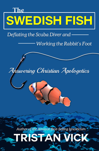
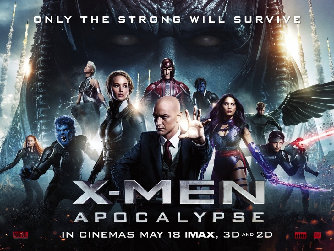
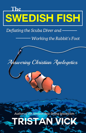
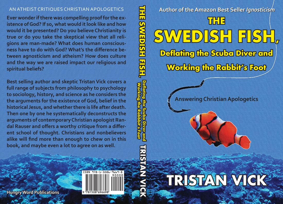
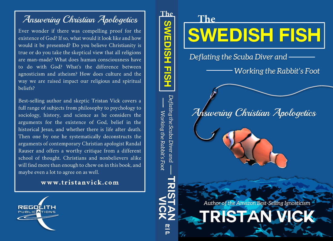
I also watched X-Men Apocalypse. I wasn't so impressed. And compared to the energy of the Ninja Turtle films, X-Men was kind blah. I liked the cast. But the story was choppy, going from slow to fast, then fast to slow. Magneto didn't know what to do in the film it seemed. He was going to become a real villain, and then Apocalypse shows up and steals his thunder. And I don't think we as an audience needed to be reminded that Magneto is angry so let's do something even more dramatic to make him even angrier then negate that anger by having Apocalypse co-opt him and try to manipulate him. And, this isn't really a spoiler, but showing how powerful Magneto was then not having him be the one to defeat Apocalypse seemed like a huge missed opportunity. At least from a storytelling standpoint that is. I mean, I don't mind how they did defeat the big baddie, but that should have maybe been a slow build to a reveal in a later film, especially since they had to re-introduce us to so many of the 80s-90s characters. Assuming they'll make more X-Men films with these characters (never mind the wonky decade gap between all the prequel X-Men films that doesn't make any sense). X-Men Apocalypse is one of those films where you can find missed opportunities for making it an excellent movie, and the filmmakers (mainly Bryan Singer in this case) went with odd choices, imho. I mean, the whole Quicksilver scene is amazing, yeah. But it's such a deus ex machina that it slaps the audience with the biggest insult of the film at the same time as being the coolest scene in the movie. And I was like... WTF? Come on, Bryan Singer! I love you, man. You made the television series HOUSE, M.D., my all time favorite show, but you're ruining X-Men. Time to hand the reins over to some fresh talent and a fresh perspective on the franchise. Can I recommend X-Men Apocalypse? I'm on the fence about it. It's not as good or even compelling as Days of Future Past, the previous film, but it's better than many previous installments, 2, 3, that first Wolverine movie that everyone wants to forget. So, I guess, if you're a fan of the franchise it's worth watching. If not, then probably not. Continuing on with my rebranding by bringing all my self-published titles under my Regolith Publications banner, I redid the cover to my counter-apologetics book The Swedish Fish. I decided to keep the fish and the theme the same, since so many people gave positive feedback on how much they liked the fish contemplating whether or not to take the bait. Indeed, it was a good concept. At the same time, I made the original cover over four years ago when I was new to the DIY aspect of self-publishing. Now that I have some experience I went ahead and redesigned the cover so it would be a bit more stylish, a little more eye-catching, and hopefully generate a few extra sales. Below is the original cover that I designed four years ago. And next, here's the redesigned version. As you can see, I went with a darker color palette and distinguished the typography so that it didn't all blend together in an ugly block of text. I went with a more artistic representation of the coral, and dropped the coral wrap-around. Although I tried a variation with the coral wrap-around, it just seems more elegant to have it on the front and leave the back simple and clean. Finally, I put the Regolith Publications logo on the cover. And walla! As with all my new covers, I included my author website. Other minor changes include having a new cleaner hook, having the fishing line come from page right instead of dropping down through the text, and moving the fonts around so as to make the balance more pleasing to the eye. I"m really proud of this new cover. It feels more like what I envisioned the first time around but didn't have the design chops to make exactly what I pictured in my mind. Now I do, and it came out rather well, even if I do say so myself.
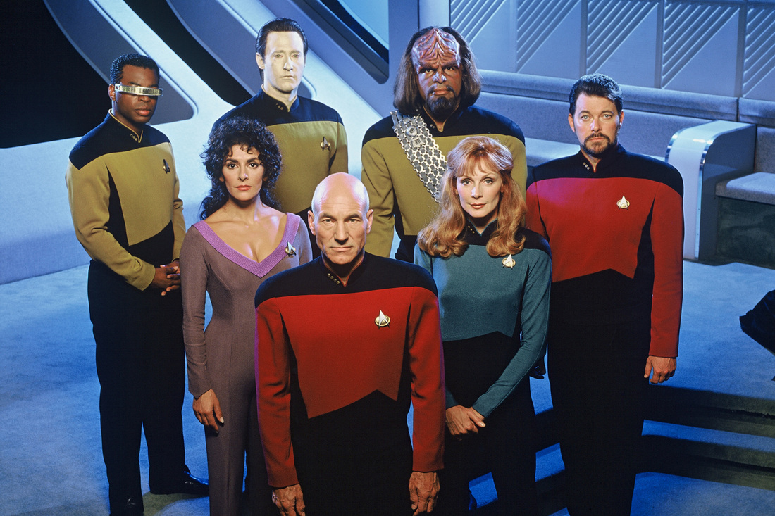
If you'd like to read The Swedish Fish you can click HERE and go to its Amazon.com page. So, before I sat down to watch STRANGER THINGS this week, which was amazing by the way, I spent the past two months binge-watching every episode of Star Trek the Next Generation. I discovered there were two episodes I had missed during its syndicated run. Night Terrors and The Devil's Due. Both were really solid, enjoyable, episodes. I really don't know why I hadn't seen either of them before, but now I have. When I got to the end of the series, I cried. I cried long and hard. Partly because I devoted every day for two months to reliving my childhood. The nostalgia factor was overwhelming. But also, and more importantly, because of how important STNG was to me growing up. My parents divorced when I was 5 years old. That would be 1985. After which we lived in various states and various towns for various amounts of time. But the one constant I always had, no matter the network -- because it was syndicated -- I could turn on a tv in a hotel, at my grandma's house, or in whatever temporary home we were in and watch STNG. It was the one constant in my life during one of the most turbulent times. And once that last scene in All Good Things, where Picard joins the poker game came on the screen... I started bawling like a baby. I sat there and cried for a good two or three minutes before I could gather myself together. Kind of fitting on the eve of Trek's 50th anniversary. So happy 50th! Finally, if you were wondering, Laren Ro (Or Ro Laren to be exact, since Bajorans apparently have their familial name first just like the Japanese do) is still my all time favorite Star Trek character, because Michelle Forbes will always be my FOREVER crush. I have a thing for those special women whose first name is Michelle and last name is Forbes, and who is by any reasonable definition a sexy as hell brunette who plays powerful leading women and was born in 1965 -- which makes her older than me -- which I totally have a thing for. Yes, Michelle Forbes is my FOREVER crush. *Swoon.*
As someone who started Indy, then got picked up by a publisher, then continued on as a hybrid author (being published traditionally as well as continuing to publish independently) I have learned over the years the important of being able to Do It Yourself.
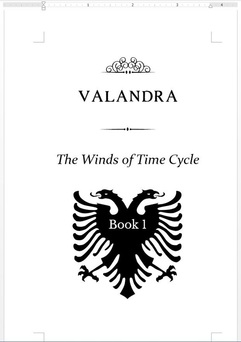
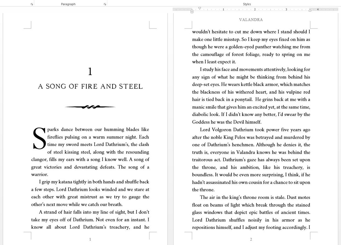
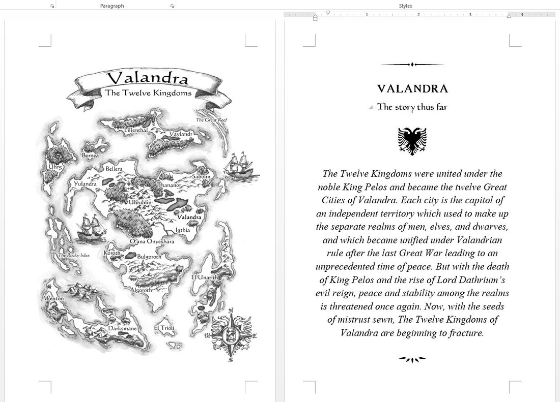
As such, when it comes to book layout and design, formatting, and typography I have found that DIY is the way to go to save money. You want to spend money on editing and cover design -- let the professionals handle the real important stuff. But when it comes to formatting, anyone can learn to format. And studying typography is easy if you have even just a basic artistic sense. If not, there are templates and guidelines which can help you out. I tend to go hog-wild when it comes to formatting and typography. I absolutely love it. Anyway, here's a sample of formatting from my upcoming book Valandra: The Winds of Time Cycle Book 1. |
Tristan VickBy day I am an educator and a cultural ambassador. By night I entertain notions of being a literary master. In reality I am just a family man and ordinary guy who works hard and loves writing just about as much as I love my family. Just about. AVAILABLE NOWNEWSLETTER
|




 RSS Feed
