|
Work, is work, is work. There's no shortcuts when it comes to just getting your hands dirty and doing the work that needs to be done. Having said that, you should probably know I love writing. As a hybrid-author (someone who is both traditionally published and chooses to continue to self-publish Indy titles alongside my traditional published work) I have created two new writing based services. I will now offer ghostwriting and co-author services. Let me briefly explain each and what each service offers.  A ghostwriter is someone who writes the book, e.g. novel, memoir, biography, etc. for you and you sign your name to the book and take the credit (even though you secretly didn't write it). Probably the most famous book that was obviously written by a ghostwriter is Star Wars: A New Hope, a novelization of the film. The book says that George Lucas wrote it, and even though it is an adaptation of his movie which he did in fact write, the book was actually written by the sci-fi/fantasy author Alan Dean Foster. As such, there are two basic ghostwriting services I will be offering as a ghostwriter: Ghostwriter Option A: ADAPTATIONS & NOVELIZATIONS If you need someone to write an adaptation your story from another medium for you (for example: a movie, musical, comic book, etc.) I can do that. More importantly, I'd be glad to! Ghostwriter Option B: MEMOIRS & BIOGRAPHIES I can help you write that biography or memoir you want to complete but don't have the time to. Maybe you're not confident in your own writing skills and need a little help. That's where I come in. I'd work with you closely to make your biography or memoir come to fruition. Of course, standard professional page rates and oversize word count fees apply. Every project is different, so pitch me your idea and I'll get back to you so we can hash out the details! So how much do ghostwriters charge? Well, that depends on several factors. According to guidelines set forth in the 2008 Writer’s Market, ghostwriters charge anywhere from $50-100 per hour for “as told to” projects and $30-115 per hour for no credit pieces. “As-told-to” ghostwriting often nets you less money per hour because you get other benefits—such as a byline, an advance and a split of the royalties (up to 50 percent). But if you’re willing to skip the byline and future earnings, you can act as a work-for-hire ghostwriter and charge more on the front end. *For more on ghost writing rates see this Reader's Digest article.* As always, you can contact me via email at: tvpikachu (at) gmail (dot) com  My second service is a collaborative writing service.
Becoming an author and writing the book is not a competition. It's not me vs. you, or you vs. Stephen King, or any other famous writer for that matter. We're all in this together, and I firmly believe authors should help each other out. This is why I've chosen to offer my talent and, more importantly, my experience and will gladly join you on your project as your co-author. Co-Author Option A: NOVELS & BOOKS Naturally, the project you higher me for will be entirely yours. I am not here to steal the show, just to lend a helping hand. Basically, I'm only here to assist you and help write alongside you. All you have to do is send me your pitch, tell me how you want to split the writing chores up, and we will keep in touch as the project progresses bouncing ideas and advice off of one another. Of course, just to be clear, I will ask up front for an even split of the royalties and my name on the by-line along with yours. Since royalties will be shared, I will charge far less per page -- making it affordable for you! If you are an established writer (meaning someone who has been published or has self published professional level works) and simply want to work with me, I can always wave the fees and just take a split of the royalties. The bottom line is: I want to work with you regardless of whether your are a beginner or a seasoned pro! Co-Author Option B: COMIC BOOK PROJECTS I will never say no to a great artist who needs a little writing help! If you are a COMIC BOOK ARTIST and want to collaborate with me, since we would both have to split the work evenly I won't charge anything up front. But if I am going to write for you, I must see samples of your sequential work (not just pin-ups or splash pages) before I decide whether I will join your project. After all, I am offering professional level plotting and script writing so the least you can do is bring the professional level art. Fair is fair, after all. In addition to hiring me to write an original project with you, I request that you send me your action-plan up front. What is an action plan? It's the part of your pitch about how do you intend to get the book published. Will you submit it to publishers like Image Comics? Or will you self-publish it? Let me know all the details. Once that's cleared away, if it looks like we're a fit, I'll email you back. As always, you can contact me via email at: tvpikachu (at) gmail (dot) com
0 Comments
 Everyone's artistic skills are different. Some have lots of practice and have mastered their trade, others are just starting out. I am not a professional graphic design artist, although I have had some training -- I majored in graphic design at my college for a couple of years before switching majors. But in no way do I count myself as a professional. The fact of the matter is, if you are anything like me (with a minimal but somewhat decent skill set), don't expect to be able to make wonderful, amazing, art right out of the gate. It takes lots of time, a fair bit of trial and error, and steadfast diligence before you will get good enough to make something that looks the way you want it to. That said, let's get on with how to make a great logo design! The first step is to brainstorm about what you feel would make a good logo design. Try and think about what your making the logo for. Is it a for small company? A pet store? A local super market, perhaps? Or is it for a certain kind of product? Maybe it's for a website? An exciting new book imprint? Or something else entirely? As you know, a logo is meant to stand out, grab your attention, and be rememberable, so it helps to take out a sketch pad and doodle some rough sketches and jot down your preliminary ideas. Once you have a few good ideas to springboard off of, and a direction, you can begin to think of things that relate or convey the general meaning of what you are making the logo for. For example, with my new book imprint Regolith Publications, I knew that I wanted to use the word "regolith" which is an astrophysics term referring to the loose top soil on moons and other planetary bodies with little to no atmospheres. When Neil Armstrong set foot on the moon, the soft soil he left his undisturbed footprint in was the regolith. Under my "Regolith Publications" imprint I plan to publish mainly science fiction and fantasy stories. I picked the word "Regolith" because it's rare, sounds cool, and relates to outer space -- perfect for a science fiction and fantasy imprint. With an idea I could springboard off of, I came up with several concepts. One was a rocket flying around a moon. Another was a nondescript planet with rings, like Saturn. After a few tries at using the rocket idea, I just couldn't get it to come out right. The rocket was always clunky or became easily overshadowed by the text graphics. So I opted to go with the planet with rings instead. 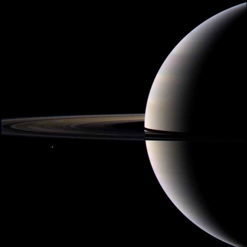 Deciding on the planet idea, I downloaded a picture of Saturn from NASA's Cassini spacecraft website to use as a template and then played around with it a bit in photoshop (I use Corel PaintShop Pro X8 -- which is a decent photo editing program that's somewhere between Adobe Elements and full on Adobe Photoshop in terms of features and capabilities. I make all my Indy book covers using PaintShop Pro). After messing around with the above image for a bit, I gray-scaled it, put some gradient tone dots on it, and painted some speckle for a starry backdrop for some added texture. I ended up with this: 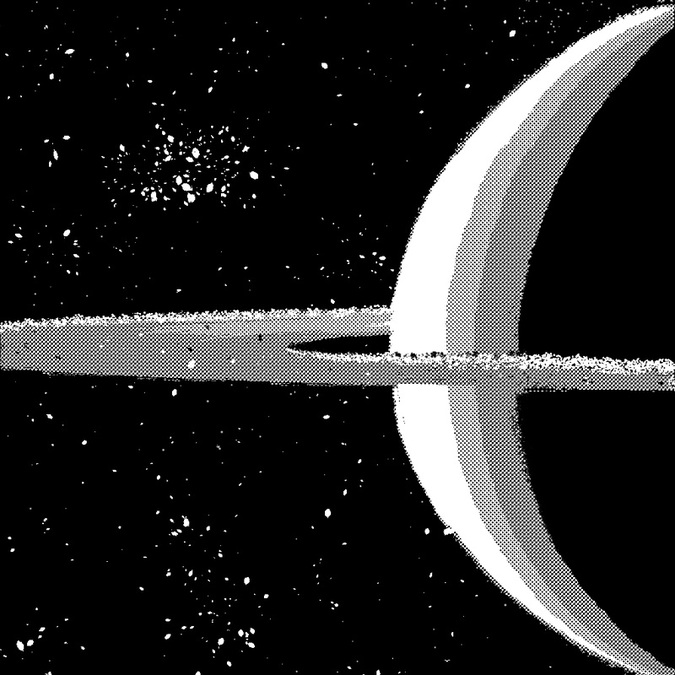 Although it looks nice on its own, it still wasn't quite what I wanted. It was too rough. Too busy. And there wasn't anywhere to place the text. So I tried playing around with it a bit more, but it still didn't look right. Dissatisfied, I decided to ditch the image and build my own image from the ground up. While I was in MS Word messing around with fonts and text samples I might like to use, I decided to use the shape tools and build a logo over the above image. I had in mind that I still wanted to use the iconic image of Saturn and the planets rings, and I tried it all on black so it would pop out. I really liked the finalized image and thought it was pretty much good to go! It was sleek, sexy, and had the right look for the text. But it's always good to test your ideas first, and so I posted it on my Facebook page for some comments and feedback. Low and behold, people found it too busy. Especially when it was made smaller. The number of lines and colors become jittery, and it makes it hard on the eyes, as you can clearly see by taking a gander at the image down below. Good, but still not perfect. 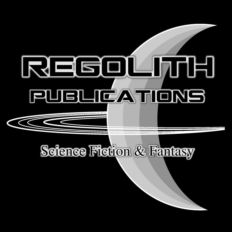 Luckily, at about this time Dean Samed, a talented graphic design artist who specializes in book covers (hey, the guy has even designed some of renowned horror author Stephen King's book covers -- so he's legit), and who I am acquainted with online, left me some friendly advice. He basically told me to strip it back even more, get rid of the extra gradients, and take out the drop shadow from behind the glowing text effect. He even built a little mock up of what he had in mind based on what I had already come up with. Needless to say, it never hurts to get a second, or even third or forth, opinion. Dean's advice was spot on. I really did have too much going on. Too many rings. To many shades of gray. Too many fonts. Text with glow AND shadow. It looked cool, but was just too dense and congested to feel like a really great logo. He was kind enough to share a quick mock-up he made, and since he is a professional graphic designer, and I'm just some DIY guy, I felt I should probably listen to him. This is the mock-up he made for me. 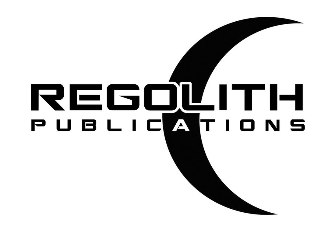 I especially liked how he made the letter "A" in the word "PUBLICATIONS" all white, giving it a little something extra. Negative space can be eye-catching, and this certainly was! After seeing his example, I knew I'd definitely use that inverse colored "A" in my final design, but I still didn't like the fact that he took out the rings. You see, I didn't want my image to be a moon, since there are plenty of moon logos already. I still wanted it to be a planet. So I really couldn't divorce myself from the idea of keeping the rings. Another thing I was iffy on was using black and white. I know black and white logos always look elegant, but I wanted mine to have at leas a small dash of color. So I went with navy blue, since it is also pretty elegant. Once I got it simplified down, for some reason it just wasn't working for me. I felt that it was too eerily similar to the symbol of Islam and the crescent moon they use on their flag. I didn't want my logo to be equated with any religion, it was supposed to be science based! That's when I realized that I should maybe tilt the image a bit in the other direction, and give the rings a sharp angle to as to be a bit more dynamic, and voila, presto! The logo finally came into being. After a lot of trial and error, and a little bit of help along the way, I finally came up with an iconic looking logo that satisfied. 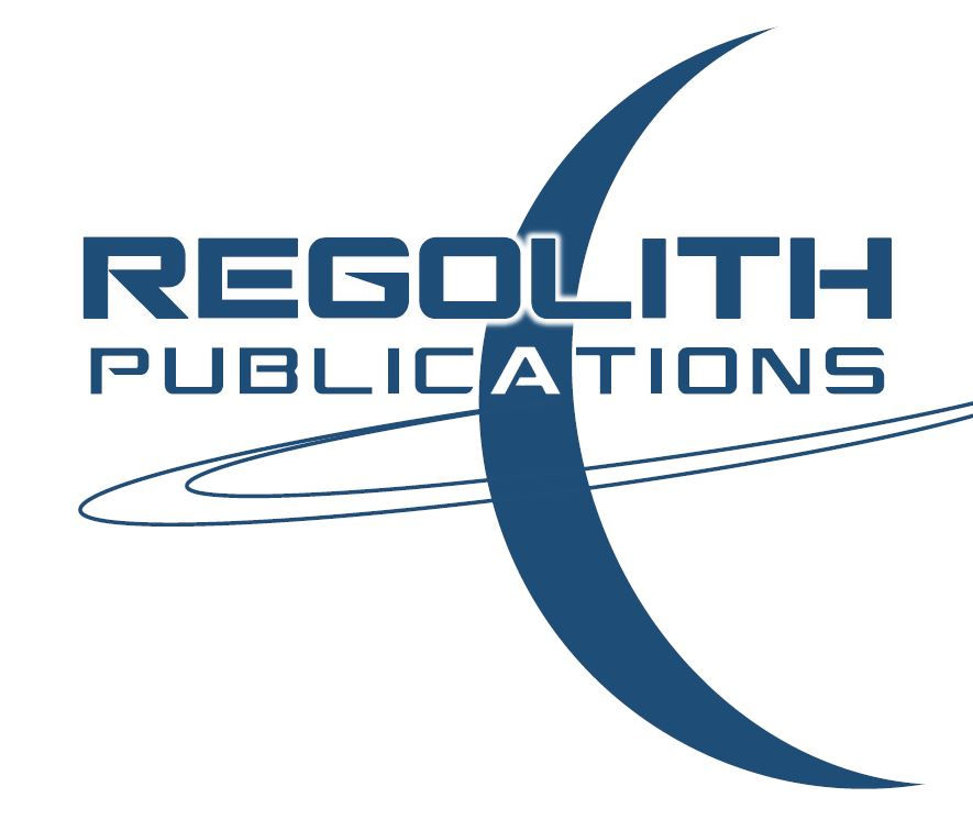 At any rate, I thought I would share my trials and tribulations of logo design with you all and I hope that you found this little tutorial helpful. And if you are designing and building your own book covers, logos, etc. then all the more power to you!
 In an attempt to keep my non-fiction and fiction works separate, I have decided to create Regolith Publications, and imprint reserved for my Science Fiction and Fantasy self-published works. At the same time, I have revised the Hungry Word Publications logo as well to streamline it and simplify it. I think people will like the new look and the new direction. By law, if you self publish you are required to have an imprint name for tax purposes. Of course, there is no rule saying you can't have more than one imprint. As such, I felt that it would be nice to keep my fiction and non-fiction work under independent banners as to avoid any confusion as to what readers might be buying. My book The Swedish Fish, for example, is about religion and philosophy -- not about a Fish from Sweden. Of course, my other titles are pretty straight forward, but still, it just felt that distinguishing my fiction work from my non-fiction work was the right thing to do. Meanwhile, I will continue to be published by Winlock Press, an imprint of Permuted Press, and have several new titles on the way! Stay tuned for some new exciting news and remember to subscribe to my newsletter to keep posted on all the exciting things headed your way!  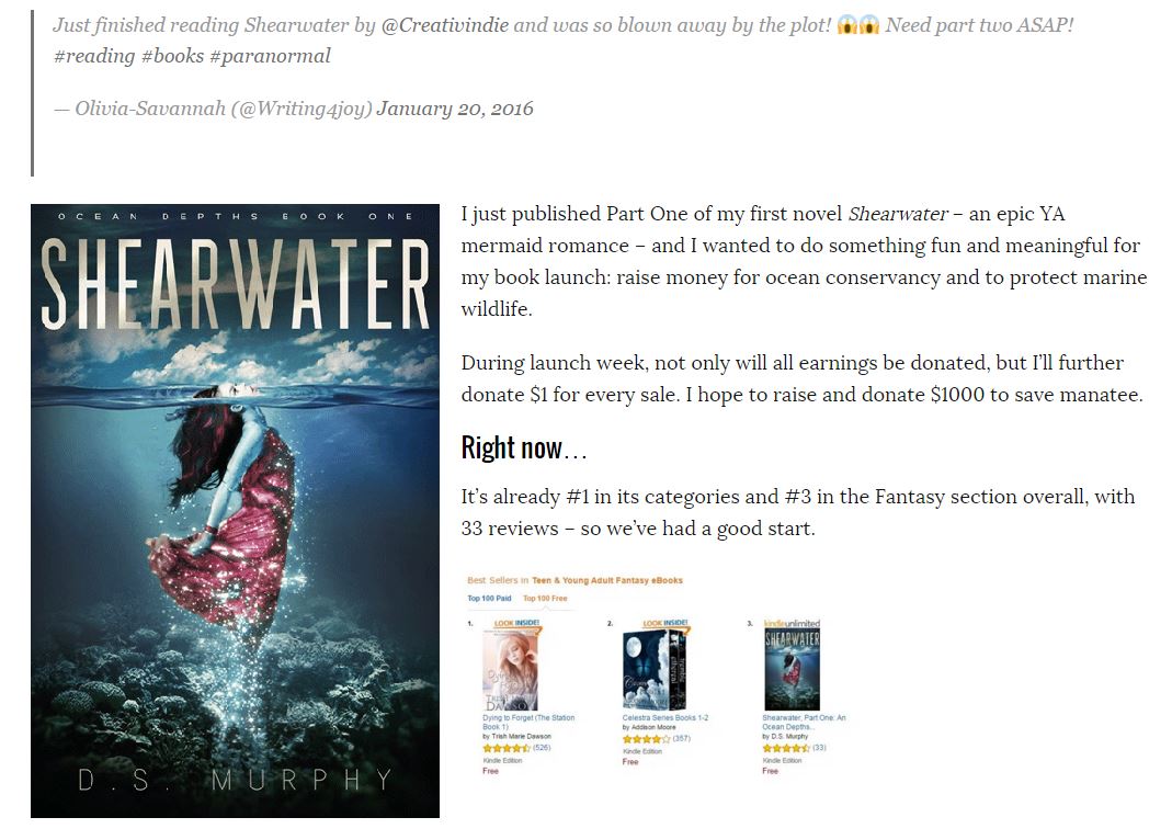 To be honest, I hate self promotion. It's a seemingly necessary evil, but it always seems overly self-serving to me. It also takes far too much time for my liking. I don't say that because I'm lazy but rather the opposite -- I'm just too goddamn busy. I am a family man raising to wee ones, have a full time day job as an ESOL teacher which takes up most of my work hours, I have a second part time job tutoring business English at HONDA car company, and all this means that when I do happen to get some free time I tend to use that to write.
Otherwise nothing would ever get done. Which means I cannot spend as much time promoting myself as I'd like. But in the full scheme of things, it seems that blatant self promotion does little to sell books. At least as far as Indy authors go. Saying "buy my book" is less beneficial than simply platforming and creating original content. So what can anyone do to try and sell their book? Well, self promote, of course. I know, I know, I said it doesn't seem to help much. But it helps enough to get the ball rolling -- which is necessary. So, even though it does hardly anything -- at least in terms of generating sales -- it's still necessary to spreading word for mouth -- which may (or may not) translate into downloads / sales. I follow the successful self-published author Derek Murphy. Now, he's successful because he knows how to market himself and he is what I'd consider a master of self-promotion. He's published his first Young Adult (YA) myrmaid novel called Shearwater and has a play by play break down of how things went as he worked at giving it a huge release push. Needless to say I simply don't have time to do much (let alone any) of this. But I did find his break down useful, and I took mental notes for things I might try in the future (if I can carve out the time from my solid schedule). I am sharing his article here because I think it will be useful for other Indy authors as well, especially those like me that struggle at running campaigns, promoting my own work, and platforming. This article [CLICK HERE] was an interesting read. Highly imformative. According to Derek Murphy, apparently pre-orders and Thunderclap campaigns do nill to nothing to help you get book sales -- even if you're actively promoting with paid promotion at the same time. It seems that paid promotion does okay, but is a huge financial drain. Getting into top slots on Amazon.com seems to require reviews more than anything -- which means more platforming and less promoting -- i.e., spending more time creating original content than simply saying 'buy my book'. I think a lot of this is pretty straight forward, but this is a good play by play break down. Here's the full link to the article: http://www.creativindie.com/why-preorders-killed-my-book-launch-and-other-lessons-i-learned-marketing-my-first-fiction/ |

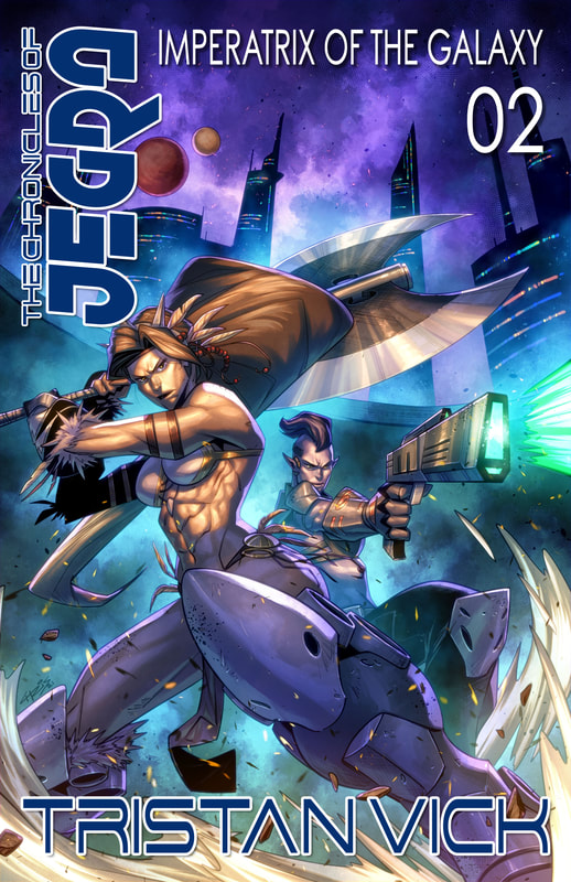
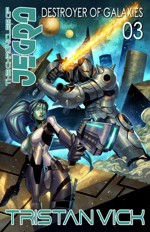
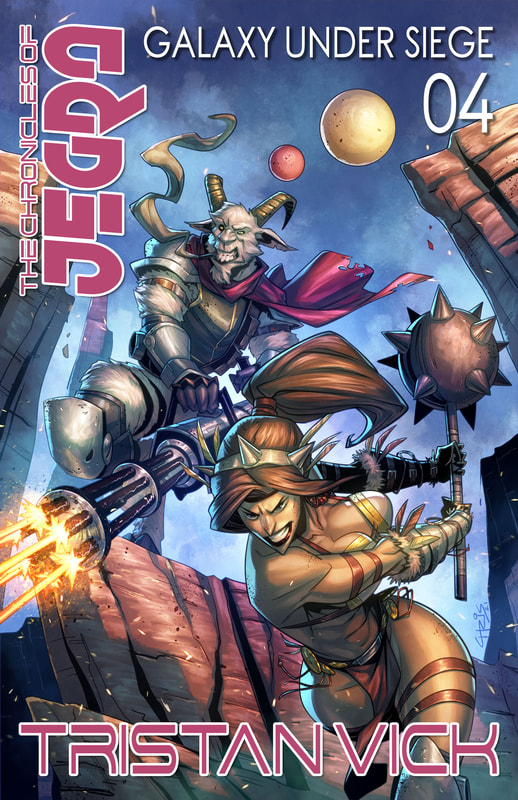
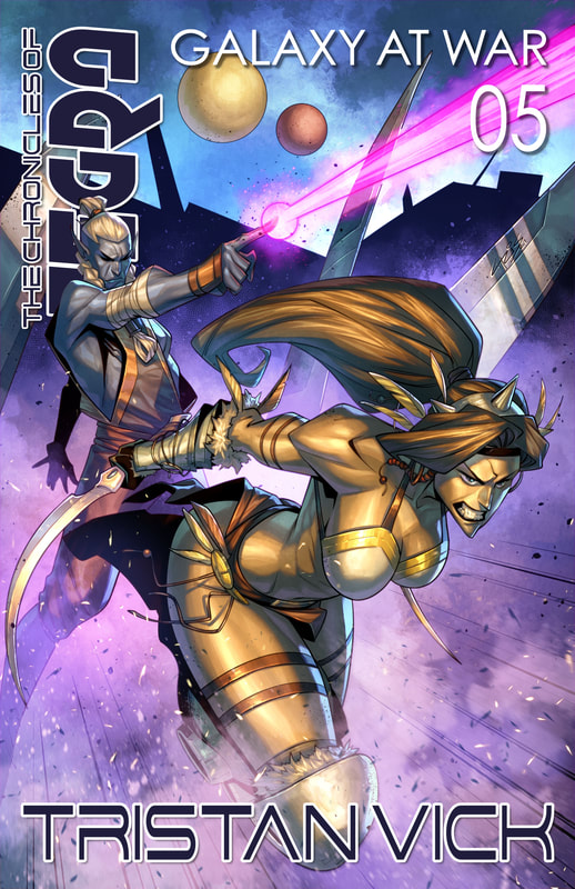
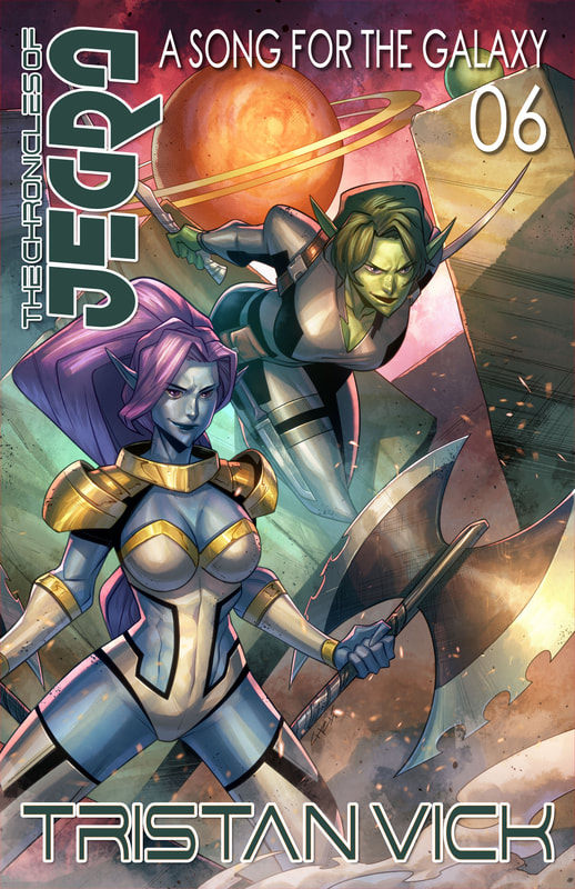
Tristan VickBy day I am an educator and a cultural ambassador. By night I entertain notions of being a literary master. In reality I am just a family man and ordinary guy who works hard and loves writing just about as much as I love my family. Just about. AVAILABLE NOW
NEWSLETTER
|
 RSS Feed
