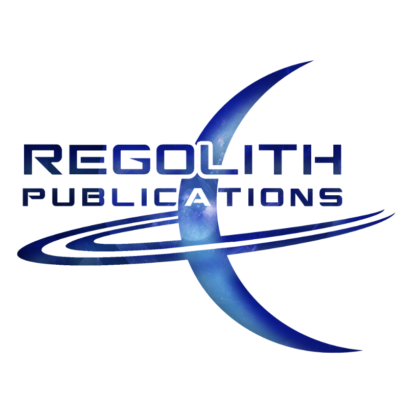
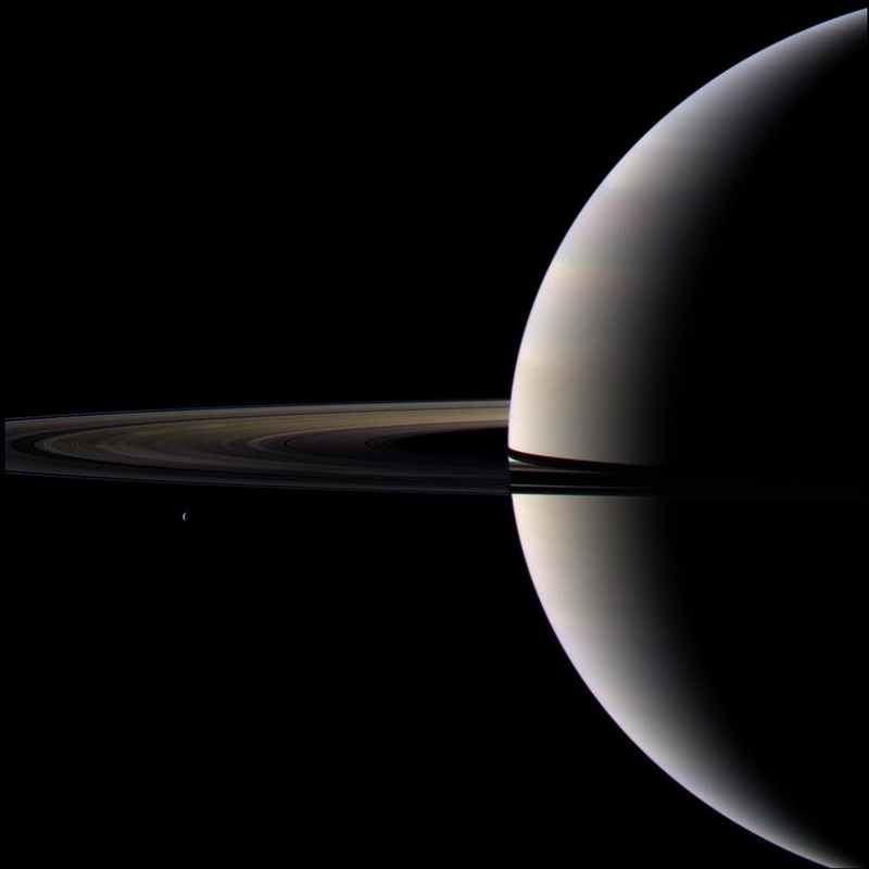
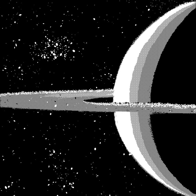
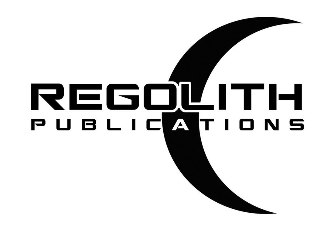
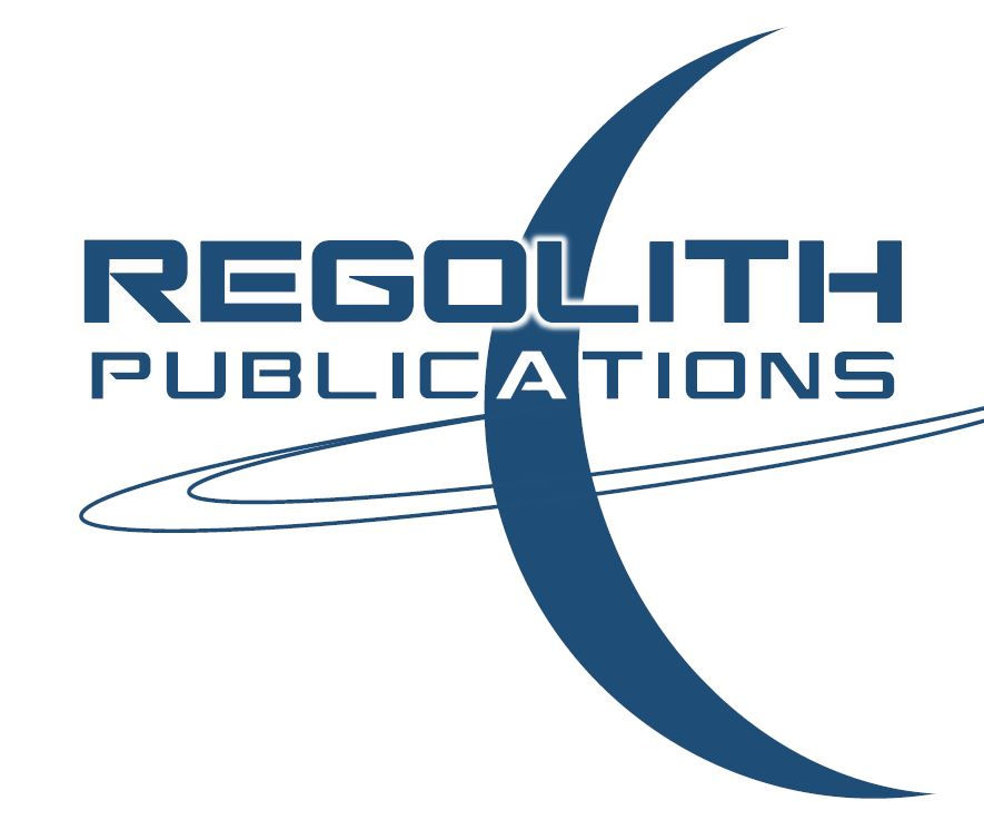
 Everyone's artistic skills are different. Some have lots of practice and have mastered their trade, others are just starting out. I am not a professional graphic design artist, although I have had some training -- I majored in graphic design at my college for a couple of years before switching majors. But in no way do I count myself as a professional. The fact of the matter is, if you are anything like me (with a minimal but somewhat decent skill set), don't expect to be able to make wonderful, amazing, art right out of the gate. It takes lots of time, a fair bit of trial and error, and steadfast diligence before you will get good enough to make something that looks the way you want it to. That said, let's get on with how to make a great logo design! The first step is to brainstorm about what you feel would make a good logo design. Try and think about what your making the logo for. Is it a for small company? A pet store? A local super market, perhaps? Or is it for a certain kind of product? Maybe it's for a website? An exciting new book imprint? Or something else entirely? As you know, a logo is meant to stand out, grab your attention, and be rememberable, so it helps to take out a sketch pad and doodle some rough sketches and jot down your preliminary ideas. Once you have a few good ideas to springboard off of, and a direction, you can begin to think of things that relate or convey the general meaning of what you are making the logo for. For example, with my new book imprint Regolith Publications, I knew that I wanted to use the word "regolith" which is an astrophysics term referring to the loose top soil on moons and other planetary bodies with little to no atmospheres. When Neil Armstrong set foot on the moon, the soft soil he left his undisturbed footprint in was the regolith. Under my "Regolith Publications" imprint I plan to publish mainly science fiction and fantasy stories. I picked the word "Regolith" because it's rare, sounds cool, and relates to outer space -- perfect for a science fiction and fantasy imprint. With an idea I could springboard off of, I came up with several concepts. One was a rocket flying around a moon. Another was a nondescript planet with rings, like Saturn. After a few tries at using the rocket idea, I just couldn't get it to come out right. The rocket was always clunky or became easily overshadowed by the text graphics. So I opted to go with the planet with rings instead. Deciding on the planet idea, I downloaded a picture of Saturn from NASA's Cassini spacecraft website to use as a template and then played around with it a bit in photoshop (I use Corel PaintShop Pro X8 -- which is a decent photo editing program that's somewhere between Adobe Elements and full on Adobe Photoshop in terms of features and capabilities. I make all my Indy book covers using PaintShop Pro). After messing around with the above image for a bit, I gray-scaled it, put some gradient tone dots on it, and painted some speckle for a starry backdrop for some added texture. I ended up with this: Although it looks nice on its own, it still wasn't quite what I wanted. It was too rough. Too busy. And there wasn't anywhere to place the text. So I tried playing around with it a bit more, but it still didn't look right. Dissatisfied, I decided to ditch the image and build my own image from the ground up. While I was in MS Word messing around with fonts and text samples I might like to use, I decided to use the shape tools and build a logo over the above image. I had in mind that I still wanted to use the iconic image of Saturn and the planets rings, and I tried it all on black so it would pop out. I really liked the finalized image and thought it was pretty much good to go! It was sleek, sexy, and had the right look for the text. But it's always good to test your ideas first, and so I posted it on my Facebook page for some comments and feedback. Low and behold, people found it too busy. Especially when it was made smaller. The number of lines and colors become jittery, and it makes it hard on the eyes, as you can clearly see by taking a gander at the image down below. Good, but still not perfect. Luckily, at about this time Dean Samed, a talented graphic design artist who specializes in book covers (hey, the guy has even designed some of renowned horror author Stephen King's book covers -- so he's legit), and who I am acquainted with online, left me some friendly advice. He basically told me to strip it back even more, get rid of the extra gradients, and take out the drop shadow from behind the glowing text effect. He even built a little mock up of what he had in mind based on what I had already come up with. Needless to say, it never hurts to get a second, or even third or forth, opinion. Dean's advice was spot on. I really did have too much going on. Too many rings. To many shades of gray. Too many fonts. Text with glow AND shadow. It looked cool, but was just too dense and congested to feel like a really great logo. He was kind enough to share a quick mock-up he made, and since he is a professional graphic designer, and I'm just some DIY guy, I felt I should probably listen to him. This is the mock-up he made for me. I especially liked how he made the letter "A" in the word "PUBLICATIONS" all white, giving it a little something extra. Negative space can be eye-catching, and this certainly was! After seeing his example, I knew I'd definitely use that inverse colored "A" in my final design, but I still didn't like the fact that he took out the rings. You see, I didn't want my image to be a moon, since there are plenty of moon logos already. I still wanted it to be a planet. So I really couldn't divorce myself from the idea of keeping the rings. Another thing I was iffy on was using black and white. I know black and white logos always look elegant, but I wanted mine to have at leas a small dash of color. So I went with navy blue, since it is also pretty elegant. Once I got it simplified down, for some reason it just wasn't working for me. I felt that it was too eerily similar to the symbol of Islam and the crescent moon they use on their flag. I didn't want my logo to be equated with any religion, it was supposed to be science based! That's when I realized that I should maybe tilt the image a bit in the other direction, and give the rings a sharp angle to as to be a bit more dynamic, and voila, presto! The logo finally came into being. After a lot of trial and error, and a little bit of help along the way, I finally came up with an iconic looking logo that satisfied. At any rate, I thought I would share my trials and tribulations of logo design with you all and I hope that you found this little tutorial helpful. And if you are designing and building your own book covers, logos, etc. then all the more power to you!
0 Comments
Leave a Reply. |
Tristan VickBy day I am an educator and a cultural ambassador. By night I entertain notions of being a literary master. In reality I am just a family man and ordinary guy who works hard and loves writing just about as much as I love my family. Just about. AVAILABLE NOWNEWSLETTER
|



 RSS Feed
