|
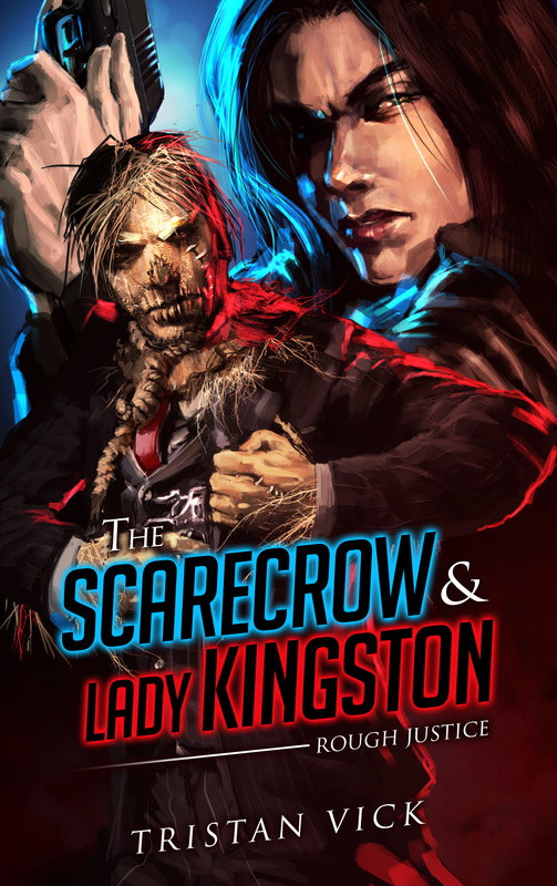
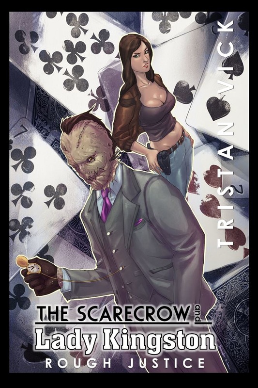
Writerly Things: My paranormal, comedic noir, detective, mystery, romance story The Scarecrow & Lady Kingston: Rough Justice is now out courtesy of Winlock Press and Permuted Press! A special thanks to the art team over at Permuted Press for supplying such an amazing piece of cover art! And that's what I wanted to talk about in this post. The struggle to find the perfect cover image. First off, I am very lucky. Not many authors get a say in their cover art. Typically what happens is you provide a brief description of the characters, then an artists (not of your choosing) gets assigned to handle the art chores, and they come up with something. Now, it goes without saying that the quality and style of artists vary widely. Some are better suited for the job than others. Some might be excellent artists but the art doesn't fit the genre or the tone of the piece. There are numerous factors to consider when dealing with cover art. I am lucky precisely because I had a bit more say in the selection process than other writers, to the chagrin of my editor (I'm sure) who had to bare with me as I kept rejecting all the cover art that came in. But you know what, I don't think she would have gone along with me if she didn't agree with me. Ultimately, your editor and publisher will put the limit on how much input you have in the selection process. Usually it's none. But I'm lucky. I am lucky because Winlock Press decided to keep me in the loop the whole time. If I had to guess, I'd say there are a couple reasons for this. First, I think it might have to do with the fact that I wrote a strange novel -- a really strange novel -- that cannot easily be classified as any given genre. The Scarecrow & Lady Kingston is a little bit Western. It's a detective story and a police procedural. It's a mystery in the classic sense of a "Who done it?" story. It's a comedy. It has unexpected romances and a thrilling sword fights on the top of a speeding locomotive (yes, both happening simultaneously). It's got a bit of magic and a bit of mischief in it. And one of the main characters is a fantasy character -- a real life, walking and talking scarecrow. The Scarecrow. John Scarecrow. Scarecrow's partner, Julie Kingston, is a detective who gets promoted to Lieutenant early on (yeah, I made her the same rank as Columbo, so sue me). She kicks ass and takes names later, and gets thrust into the limelight when she starts dating a celebrity. The story has assassinations, gangsters, prostitutes, murders, Hollywood celebrities, and even a giant robot fight toward the end. It is literally a novel that cannot be pinned down. The story is something along the lines of if you were to take Twin Peaks, L.A. Confidential, and The Wizard of Oz and mix them all into a batter, then bake that batter in the format of a sitcom that's romping around with a romcom, only to pull out a cake made from a recipe nobody has ever seen before. So, yeah, how do you draw the art for such a strange Chimera of genre fiction? I'm lucky because when the first cover art came in my editor agreed with me when all I could say was, "What's that?" It didn't look like my characters. It didn't even follow the character description guidelines given to the publisher. So it was a pass. That's not to say the artist wasn't talented, but they simply were wide of the mark. Then I showed the powers that be some art that I had commissioned of my characters, and they all loved it. So we contacted the artist and got their permission to use it commercially for the book cover, at a small price of course, since no artist should have to give their art away for free. Now we were really over budget. On top of this, I had to delay the project because we had no official logo or title piece for the novel. After all, it was supposed to be part of a series. This, of course, bothered me because when it comes to long series and their cover art, even the title itself, things like continuity and brand recognizability matter. Think of your favorite fantasy series of novels and their cover art. Whether it is George R.R. Martin's Game of Thrones covers or the Harry Potter novels, there is a specific style and consistency you come to expect from these epic series. Publishers want to create a recognizable brand. Something that will speak to your from the bookshelf and whisper innocently from the end-cap book display, "Buy me, buy me!" I'm lucky because Winlock Press totally agreed with me. But they were strapped for time. Also, the budget for the book was spent. And so, I offered my own suggestions using my own commissioned art. This is what I came up with. I'm lucky because the hard working folks at Winlock Press liked what I came up with (at the last minute, over budget). At long last everything came together and was sent off to Permuted Press, who has the final say in the matter. Relief! But then the unspeakable happened. To our surprise Permuted Press said "no" to the cover as it wasn't in tune with their publishing standards. That was a shocker, because the art was top notch. But I get it. Permuted Press sells horror, paranormal, and science fiction and here was a peculiar genre bending book coming from their imprint Winlock Press that they couldn't even classify as any set genre. And how does one select the "right" tone for such a thing? As a publishing company that has a certain feel to their books, it makes perfect sense that Permuted Press didn't want pastel colors and hip anime-esque characters adorning the cover of one of their books. It's just not in tune with their publishing standards. I get it. I do. So it was back to square one. But by this time the book was stuck in limbo, because it was already three times over budget and now passed its deadline too! (Totally my fault by the way!) And still nobody was satisfied. That's about the time I felt as though the book might get scrapped, or put on the back burner indefinitely. But then Permuted Press stepped up and took over the cover responsibilities. And come what may, whatever they came up with was going to go straight to the press. The image at the top, with its cool blue contrasting the bright red, and the moody noir feel done up beautifully in a painted style is what we got. And I think you'll agree that it's stunning. Did I mention that I was lucky? Not only am I lucky to be under the Winlock Press banner who cares enough for their authors to keep them in the loop and as a part of the creative process, but I am lucky to be part of a new wave of publishing that isn't simply about making the bottom dollar but cares deeply about putting out the best product possible. So count me lucky. And, not to sound entirely self-serving, let me wish the best of luck to all you aspiring writers and artists out there too! Carry on doing what you love to do best, and stay awesome!
2 Comments
Leave a Reply. |
Tristan VickBy day I am an educator and a cultural ambassador. By night I entertain notions of being a literary master. In reality I am just a family man and ordinary guy who works hard and loves writing just about as much as I love my family. Just about. AVAILABLE NOWNEWSLETTER
|

 RSS Feed
